Component Library
The Component Library contains all the design elements used to build websites at UNI. These elements can be used and reused as much as needed. It helps editors and developers work in a consistent manner and increases time efficiency. It’s like a puzzle, all the parts are there, and as an editor, all you need to do is add and arrange them in the order you desire.
Component Categories
The components in the Component Library have been separated into seven categories to assist you in finding the components best suited for your site.
Lead Text Component
The Lead Text area of the page is a component that is automatically on all pages. It contains the site/page title and a paragraph or two of lead text to the left and the site menu to the right. The Lead Text should provide an overview of what the user will find on the page, as that information is selected by Google for a description of that page. That's very important for Search Engine Optimization (SEO).
The most basic, and most flexible component, is the Text Block component. It supports a variety of options and layouts.
A Spacer adds space between components, in either white (default) or a selection of color backgrounds. There is a Spacer component for demonstration purposes on either side of the Text Block example below. It adds 24 px of space. If more space is desired, additional Spacers may be added.
A Pulled Quote has fields for the quote (don't add quotation marks, they're in the theme), with optional fields for author and author label. There are several different layout variations for Pulled quotes, including with and without photos.
Text Block
The text block features the standard UNI Drupal text area with multiple columns and other tools available. Multiple background colors are available for the Text Block, including this color, Prexy's Pond, as well as the default white, Dome (light gray), Panther Purple (official UNI purple) and Dark Purple.
Text blocks have the option for columns:
Column 1
This is an example of two columns. Each column is 50% of the text area in this two column layout. Images, links, and lists may all be added to columns to create the desired layout.
For more on columns and other tools available for Text Blocks and other components, see the section on the WYSIWYG Editor below.
Column 2

Using the WYSIWYG Editor in Text Blocks and other components
In Text Blocks and other components, the WYSIWYG Editor (What You See Is What You Get) allows you to style and layout your content.
- Paragraph - Select from paragraph or Heading 2 (H2) to Heading Six (H6) for font size. Heading 1 is not listed, because it is reserved for the site/page title.
- Styles - Switch H2 or H3 headings to Proxima Nova, with a slightly smaller text size. It can also be used to style a button.
- Bold, Italics, Left/Right/Centered justification - used to style your text. Underline is not included because only text that is a link should be underlined (which happens automatically)
- Block Quote lets you easily include block quotations or pull quotes within a text block. A similar function is provided by the Pull Quote component.
- Accordion is used for creating dropdown lists of content, such as an FAQ.
- Templates provide multiple layout options for content, including two column (50/50), two column 1/3 2/3, two column 2/3 1/3, three column, three column wide middle and four column. Also available in templates are variations to the horizontal rule for shorter than full-width rules (12.5%, 25%, 50%). A button may also be created using a tool in Templates.
- Link is used to add a hyperlink to text.
- Bookmarks are used for anchor links, to link to content further down on the same page.
- IMCE File Manager allows you to upload and access images and files on the site.
- Upload Image from Computer is used for uploading an image from your computer.
- Video Embed inserts a video that has been uploaded to the UNI account in YouTube.
- Numbered and Bulleted Lists and Indent/Outdent are used to style lists of content on the site.
- Table tool is used for inserting tables on a site. Tables should only be used for presenting data requiring the use of a table, and should never be used for page layout purposes.
- Horizontal Rule places a colored rule across the width of the content.
- Tx cleans up text with leftover code, usually from content copied and pasted from another site or document.
- Show Blocks visualizes all block-level elements by surrounding them with an outline and displaying their element name at the top-left (usually a paragraph or heading))
Pulled Quotes
Pulled quotes have been updated to allow multiple variations. For text only, the look has been updated, and the option to have a color background or white background. The text may also be left aligned or centered. 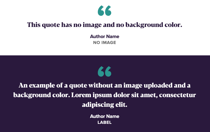
In addition to the text option, there is now also an option with a photo. Just like with Two-Column Callouts, the photo may be on the right or left side, and may include a button link or not. 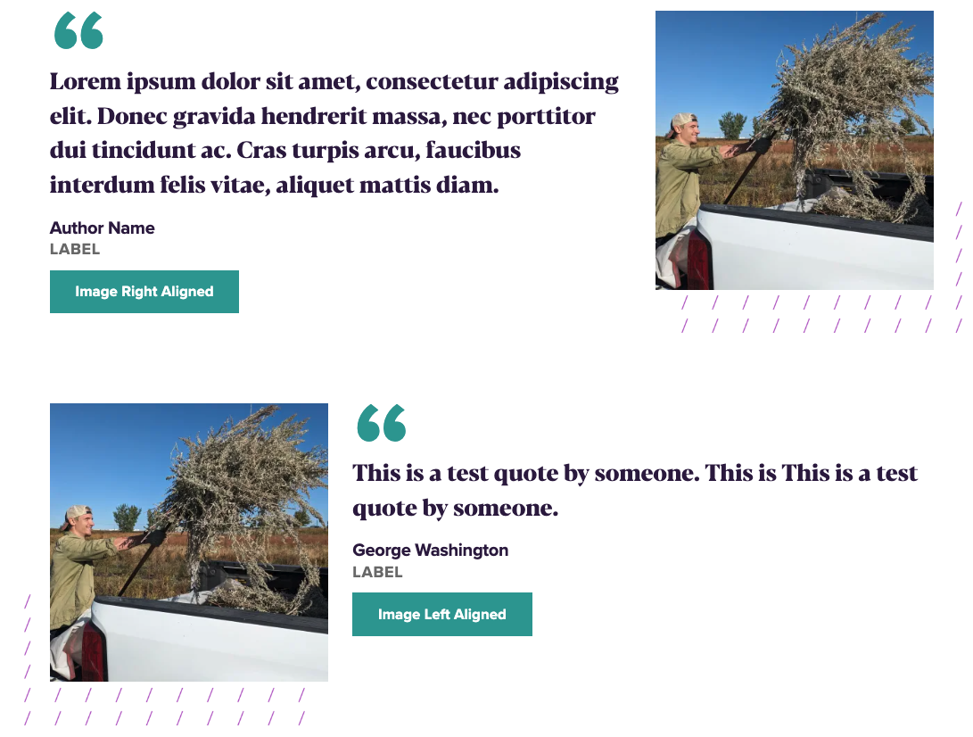
Two-Column Cards and Two Column Callouts can be used to draw focus on special programs and information. They usually feature photos or images, along with titles and body text, and a link for more information. Tabbed blocks allow a similar display, but utilizing tabs to display similar content in a tabbed format. Quick Facts provides a method to present pertinent facts about your program or UNI. The Features component is designed for alumni, staff or student feature stories.

Two Column Callout
There are a number of options, both with the image and the other elements, when displaying the Two-Column Callout.
Image options:
- May be displayed on the left or the right
- Full-width of browser or width of main column, as shown
Other optional elements:
- Subtitles
- Links
- Body
Two Column Cards
Card One Title
The Two Column Cards are similar to the Two Column Callouts, but display their information with text above a smaller image than the Callouts.
Options:
- Subtitle
- Link Title (displayed in the green box)
- Displaying an image
- Displaying a video
- No image or video
- Cards may be linked to another site or page

Card Two Title
The Two Column Cards are similar to the Two Column Callouts, but display their information with text above a smaller image than the Callouts.
Options:
- Subtitle
- Link title (displayed in the green box)
- Displaying an image
- Displaying a video
- No image or video
- Cards may be linked to another site or page

Two, Three or Four Column Billboards
Billboard Title
Billboards can contain any combination of title, body text and links.
Tabbed Block
Tab
Subtitle
Multiple tabs may be added. The Tab Title is what shows in the tab area, and the Tab Subtitle is displayed just above the body content. All fields except the link field are required. Links are optional.

Tab
Subtitle
Multiple tabs may be added. The Tab Title is what shows in the tab area, and the Tab Subtitle is displayed just above the body content. All fields except the link field are required. Links are optional.

Tab
Subtitle
Multiple tabs may be added. The Tab Title is what shows in the tab area, and the Tab Subtitle is displayed just above the body content. All fields except the link field are required. Links are optional.

Tab
Subtitle
Multiple tabs may be added. The Tab Title is what shows in the tab area, and the Tab Subtitle is displayed just above the body content. All fields except the link field are required. Links are optional.
Tab
Subtitle
Multiple tabs may be added. The Tab Title is what shows in the tab area, and the Tab Subtitle is displayed just above the body content. All fields except the link field are required. Links are optional.
Tab
Subtitle
Multiple tabs may be added. The Tab Title is what shows in the tab area, and the Tab Subtitle is displayed just above the body content. All fields except the link field are required. Links are optional.
in the
Midwest
Ranked in the “Best Regional Universities (Midwest)” according to US News and World’s 2020 report.

Affordable
Education
Your education and your career success are not about debt and finance. Your knowledge is about making a better future. At UNI, we're committed to keeping college affordable while providing practical education.

AACSB
Accredited
Earn your MBA from a university that’s accredited by the Association to Advance Collegiate Schools of Business International.
Features Component
Alumni Spotlight


Four Square Carousel
- You must upload at least 4 images for the carousel to appear. If under 4 images are uploaded, a warning will show.
- You may have up to 20 images in the carousel.
- Several different background colors to chose from.


Two Column Image Boxes
What is Applied Engineering?
Applied engineers are engineers
- Title and subtitle are available, along with a body text box.
- Three photos, one small, one medium and one large. The size layout of the photos is fixed and cannot be changed.
- The overall all layout may be flipped, with the photos either to the right or the left of the body text.
- Two background color are available.
Three Card Carousel/Gallery
There are two different uses for this component, as a carousel of images or as a gallery.
- Carousel - Cards will give you 3+ images with button overlays.
- Carousel - Gallery adds 3+ images without buttons, clicking on the images will open them up full-size in an overlay, like a photo gallery.


FormAssembly / Webform Components
FormAssembly Forms
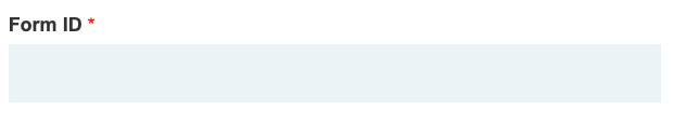 To add a FormAssembly form to a site, enter the Form ID for your FormAssembly form into the field provided for it in the FormAssembly component. You also have optional title, subtitle and body fields, as well as other optional settings pertaining to your specific FormAssembly form.
Drupal Webforms
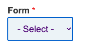 To add a Drupal Webform, first have the Drupal webform created by the IT-Client Services webteam, then place the Webform component on your page and Select the appropriate form name from the drop-down list under Form.
As with the FormAssembly form, You also have optional title, subtitle and body fields available, as well as other optional settings pertaining to your Drupal Webform.
There are a variety of components to display links to other web pages or sites.
-
The Full-Button Width Callout may be used to highlight a particular call to action, such as Apply for Admission.
-
A Full-Width Link List displays a title and three links below and to the right of the title.
-
The Two-Column Link List may be used to display similar groups of up to six links, such as a Quick Links section, with a title and a photo that may be displayed on the left or the right.
-
The Link List may also be used to display similar groups of links, with a title and text section to the left of the links. A subtitle is optional.
-
The Link List Accordion provides a visible title field with a drop-down accordion list display, an optional body field and a list of up to six links.
-
The Contact Us/Social Links component is a way to display links to your social media sites. The subtitle, title, body and social Links title are all optional, and may be used in any combination with the social media links. The social media icons are preset, so all you need to do is enter in the link to your social media sites in the appropriate field.
Full-Width Link List

Two Column Link List
The Accordion provides a visible title field with a drop-down accordion display an optional Body field and a list of up to eight links.
Directory
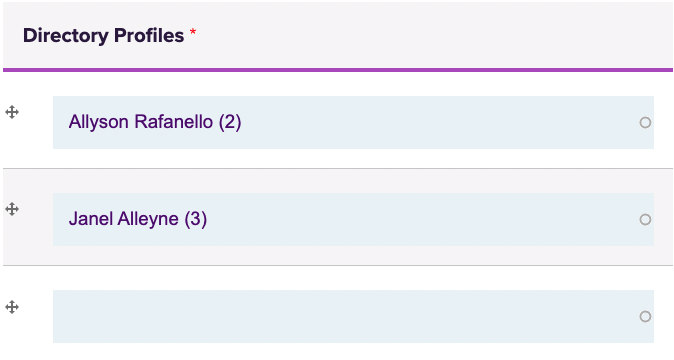
A faculty/staff directory is added by using the Directory content type to create a directory page for each member of the department (or other group being represented, such as an advisory committee). A Directory component is then placed on the appropriate page, an optional title and body section may be added, and the people you wish to add are selected for the page by adding their name to the Directory Profiles fields. Once names are added, they can be arranged in whatever order you prefer, by department hierarchy, alphabetically, etc.
More than one directory may be added to a page, to display more than of group of department members. An example of that may be found on the College of Business Deans office page as well as on a number of other UNI sites.
A News or Events section can be added to your site to feature content developed with the News content type or Events content type.
A photo may be included on either News or Events, but it is recommended you either use photos or you don't for each of those blocks. Having photos on some, but not all News items, for instance, creates an odd looking display.


Upcoming Events
You Can't Pour From an Empty Cup: Self-Care 101
Mon, Feb 02 2026
11:00am - 12:00pm
Zoom
Getting the Most Out of Your UNI Benefits
Tue, Feb 03 2026
1:00pm - 2:30pm
Gilchrist 009
Tax Mistakes Could Be Costing You—Learn How to Avoid Them
Tue, Feb 10 2026
2:00pm - 3:00pm
Gilchrist 009
Announcements
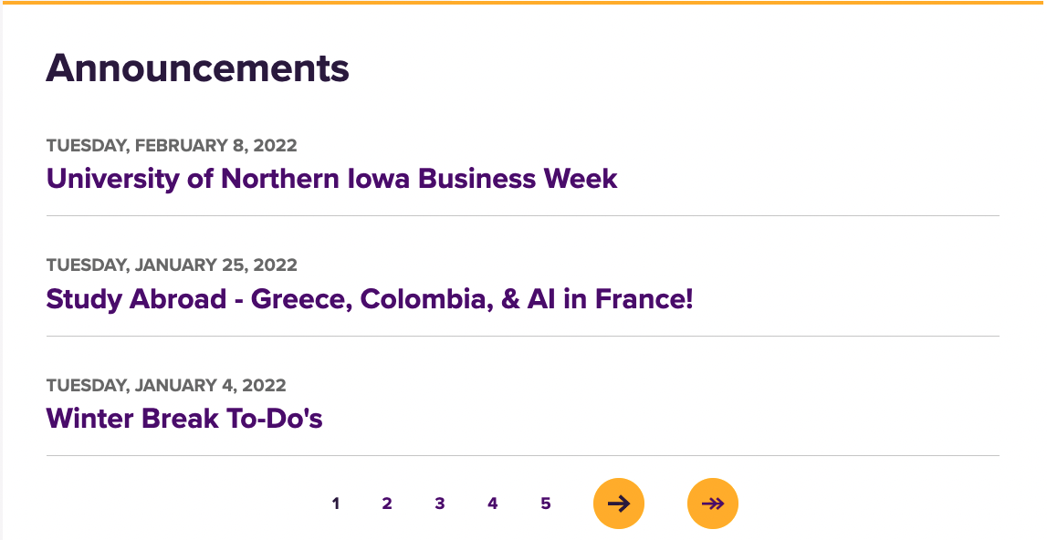
The Announcements content type and component may be used to add brief department announcements on a page. Announcements are added to the site using the Department Announcements content type, then an Announcements component is place on the website page where you want them to appear. The example is the announcements section on the College of Business Student Hub home page.
Each announcement title is a link to the full text of the announcement. Three announcements appear at a time on the component, when more than three are added, the rest are linked via the pager just below the last announcement.
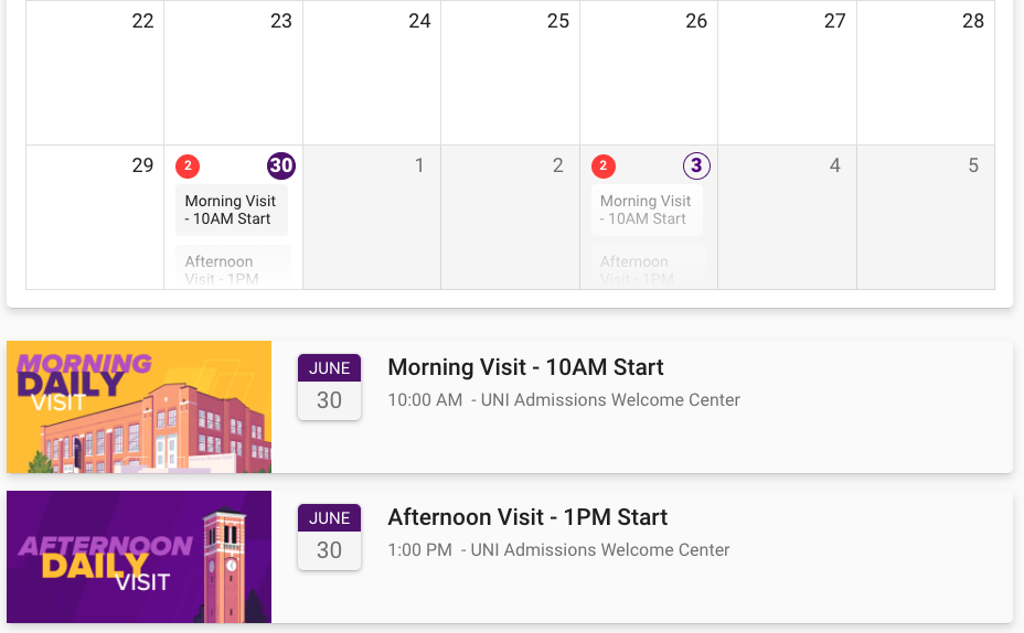
Blackthorn Calendar
A feed from your department's Blackthorn calendar of events (used for event sign-up) may be added in a component. Add your Blackthorn ID in the provided field (it's the portion of the URL after https://events.blackthorn.io). That will embed the calendar on your site.