Logos
The University of Northern Iowa’s identity is much more than a logo. However, the logo is one of the most important parts of the visual expression for any brand. There is a place and a purpose for each of the university’s logos.
The new university logo is bold and modern and designed for UNI’s future. This effort serves to uphold our rich history of educational excellence, reinforce the institution’s historical roots while uniting various partner entities.
Primary Logo
We are UNI. From our alma mater and fight song, to our students, graduates and supporters, our legacy is in these three beloved letters. Our primary logo reinforces this legacy, by incorporating “UNI” in our mark. It is a symbol designed specifically to uphold our campus culture, stand out in the market and unify our brand. An approved university logo must be utilized in all communications and collateral.

Clear Space and Minimum Size
Clear Space
To allow the best visibility of our brand marks, nothing should encroach into the space surrounding our logos. The amount of clear space around the logo must be no smaller than the height of the “I” in the UNI monogram. Do not place text or any graphic element within the clear-space area.

Minimum Size
In order to ensure legibility, the logo must not appear smaller than the following dimensions:
Print: 0.25 inches in height/tall
Digital: 200 pixels wide

Secondary Logos
In addition to our primary logo, two secondary options are available, though should only be used when compositionally appropriate.
These logos have been carefully crafted and should be used exactly as seen here. To maintain the integrity of the logos, do not add, alter or remove any elements from the design. Do not create or add additional characters to this mark. Do not stretch or distort the logo in any way.
An approved university logo (primary, secondary or sub-brand) must be included on all materials and communications.
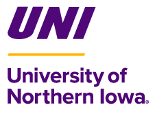

Clear Space and Minimum Size
Clear Space
To allow the best visibility of our brand marks, nothing should encroach into the space surrounding our logos. The amount of clear space around the logo must be no smaller than the height of the “I” in the UNI monogram. Do not place text or any graphic element within the clear-space area.

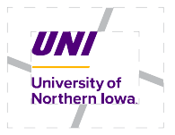
Minimum Size
In order to ensure legibility, the logo must not appear smaller than the following dimensions:
Horizontal Secondary Logo
Print: 0.25 inches in height/tall
Digital: 300 pixels wide

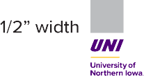
Vertical Secondary Logo
Print: 0.5 inches in wide
Digital: 120 pixels wide
Logo Usage
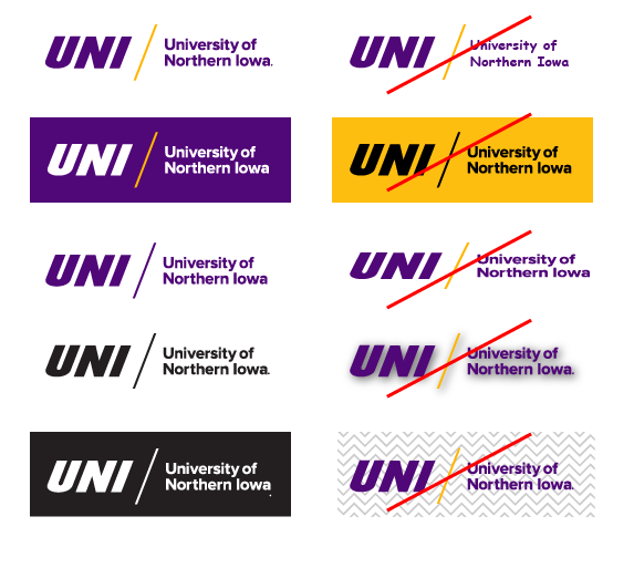
Whenever possible, use a two-color primary logo (purple and gold or white and gold) for print and digital applications. For projects or publications limited to a single color, one-color purple, black or white logo options are available.
The logo should always have proper contrast for both legibility and accessibility. Two-color logos are to be used on white or color backgrounds that don’t interfere with the logo’s reproduction and visibility. A logo may be used on photographs or subtle patterns as long as contrast and legibility are maintained.
To maintain the integrity of the logo, do not add, alter or remove any elements from the design. Do not create or add additional characters to this mark. Do not stretch or distort the logo in any way.
"UNI" Monogram
The monogram is the graphic element made up of a combination of one to three letters to create the UNI symbol in the primary logo. The monogram increases visual recognition and recall as the University of Northern Iowa; therefore, it should not be broken apart from the primary logo without permission from the Office of University Relations. Breaking the monogram apart from the logo without permission jeopardizes our ability to establish a consistent recall that “UNI” stands for the “University of Northern Iowa” and not “University of Northern Illinois.”
The “UNI” monogram is protected by the University of Northern Iowa trademark. In approved situations where the monogram is used apart from the primary logo in promotional items, it must use the ® mark.
University of Northern Iowa Wordmark
The wordmark is the font-based component of the logo that reflects the University of Northern Iowa name. Similar to the monogram, the wordmark should not be used independently from the primary logo without permission from the Office of University Relations.
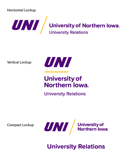
Lockups provide academic and administrative units an opportunity to be recognized while maintaining brand-connectedness.
Lockups are developed according to the university brand strategy and are available in Photoshelter for download using CatID. If you do not see a lockup for your unit or programs, please email the Office of University Relations at brand@uni.edu. Do not attempt to create your own lockup.
Downloading Your Lockups
The lockups are organized by intended use. The Print folder contains horizontal, vertical and compact logos in EPS, PDF and high-resolution JPG formats. Please note that the compact lockup was added to provide more functionality for space-constrained applications, like apparel.
The Web folder contains horizontal and vertical logos in JPG and PNG formats.
Do not modify the colors in any of the lockup logos.
Please note that while lockups can be utilized, it is also acceptable to use the primary university logo and include the unit name in text separately in materials or communications.
An approved university logo (primary, secondary or lockup) must be included on all materials and communications.
Endorsed Logos
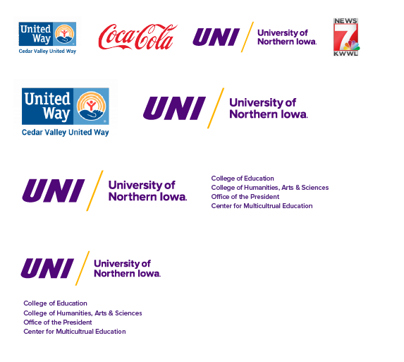
An Endorsed Brand of the University of Northern Iowa is one whose mission differs from that of the university and/or whose primary purpose is to serve an external audience. Instead of using the University of Northern Iowa name and logo as its main identifiers, endorsed brands have their own name and logo and must reference the university logo in a secondary position in digital and printed materials and on promotional items.
In situations where space does not allow for two logos, a compact logo that includes ‘University of Northern Iowa’ can be requested from University Relations.
An endorsed brand uses its own brand guidelines that are created with University Relations to complement the University of Northern Iowa’s brand guidelines. If you have questions on if your unit should live in the branded house (lockup) or be endorsed, please email brand@uni.edu.
Co-branding & Co-sponsorship
Co-branding or Co-sponsoring With External Entities
When co-branding or co-sponsoring an event or communication with external entities, the university logo should follow UNI’s established standards in balance with partner logos. For example, follow preferred logo and color usage, maintain clear space and ensure equal placement to our partners when appropriate.
Co-branding or Co-sponsoring With Internal Units
When co-branding or co-sponsoring an event or communication with other UNI units that lock up under the institutional logo, use the primary UNI logo and include a list of unit names in text below or to the right.
Logo Do's and Don'ts
To maintain the visual integrity and trademark of the UNI logo, the Office of University Relations suggests the following:
DO
- Use a two-color primary logo (purple and gold or white and gold) for print and digital applications. For projects or publications limited to a single color, one-color purple, black or white logo options are available.
- Use a standard lockup logo when representing academic units and departments.
- Include an approved version of the University logo (lockup, primary or secondary) in all forms of print marketing.
- Ensure the trademark symbol is present for any retail or promotional item use.
- Only provide the brand mark files to trusted partners and licensed vendors.
- Consult with the Office of University Relations for questions and guidance on logo usage.
DON'T
- Don’t stretch, squish or alter the aspect ratio of the brand mark.
- Don’t add a stroke, outline or any other design element to the logo.
- Don’t lock up additional information, text or graphics with the logo.
- Don’t rotate the logo.
- Don’t substitute or change the typeface or font used in the logo.
- Don’t place the logo on complex or detailed backgrounds that compromise legibility.
- Don’t place the logo on background colors that compromise readability or contrast.
- Don’t re-color or re-sequence the colors of any part of the logo.
- Don’t apply filters or Photoshop-style effects to the logo.
- Don’t use the UNI monogram without the accompanying University of Northern Iowa wordmark.
- Don’t rearrange elements of the logo.
- Don’t crop the logo or put it inside a frame.
- Don’t use “UNI” when naming endorsed brands, campus events and activities and creating graphics and headlines. This avoids redundancy in the branded house and eliminates the urge to use UNI in a different typeface.
